
See how we created a Power BI data visualization system and spread its adoption enterprise-wide
Design Toolkit![]()

Functionality and Beauty are Contagious
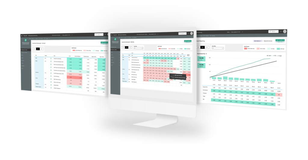
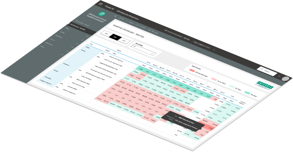
We created a data visualization system for use across INTEGRIS Health, a medical system with numerous hospitals and clinics. Rolling it out, we made a push to spur its use across all departments, thereby increasing the data literacy of people in disparate roles. Now, many more people are able to get business value from custom reports and dashboards.

Teaching the Teachers
The first thing we did was to organize a workshop with the INTEGRIS Clinical Business Intelligence Group to review the universe of existing reports and identify the key challenges of creating and distributing them. We then interviewed many different consumers of the reports, including both hospital administration and clinical staff members.
Using the findings, SolBurst created a comprehensive Analytics Design Guide, which is used to improve legacy reports and develop new reports. It provides guidance on when and how to use different types of visualizations, as well as recommendations for when to use specific colors, fonts, and layouts.

A System Built with Many Layers
Our Analytics Design Guide has multiple chapters, each addressing a key aspect of data visualization and dynamic reporting. It clearly shows how effective visualizations are composed on multiple, detailed layers.
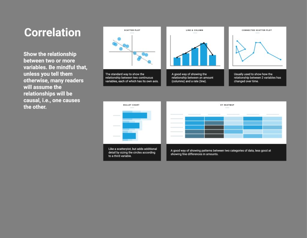
Principles of Data Visualization
Explains the visual patterns that are most effective in communicating different types of information
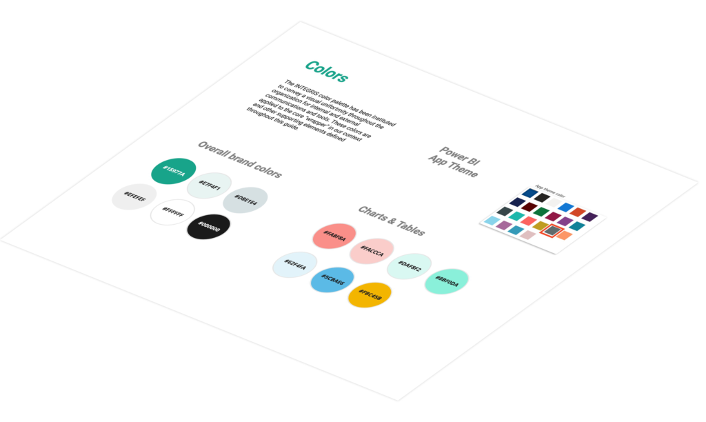
Color and Styles
Shows how the artful application of shape, color, contrast, and typography enables people to better interpret the data
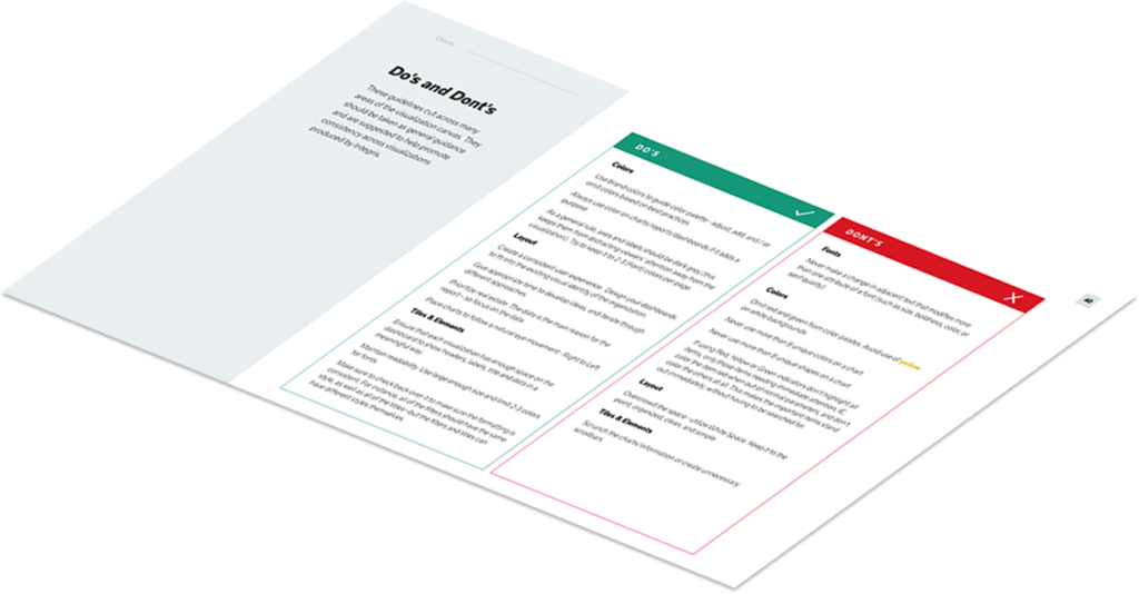
Best Practices
Explains what data design strategies have proven to work over time and whyy
Managing Power BI Applications
Visualizations are dynamic. Many times, they include a set of interactive elements that people can use to filter the data to gain insights.
Visibility and Transparency
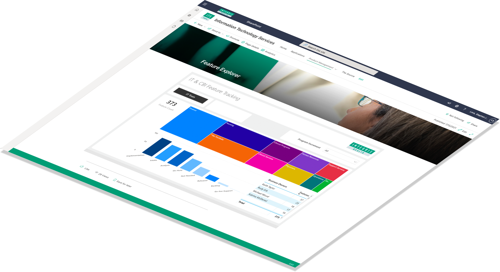
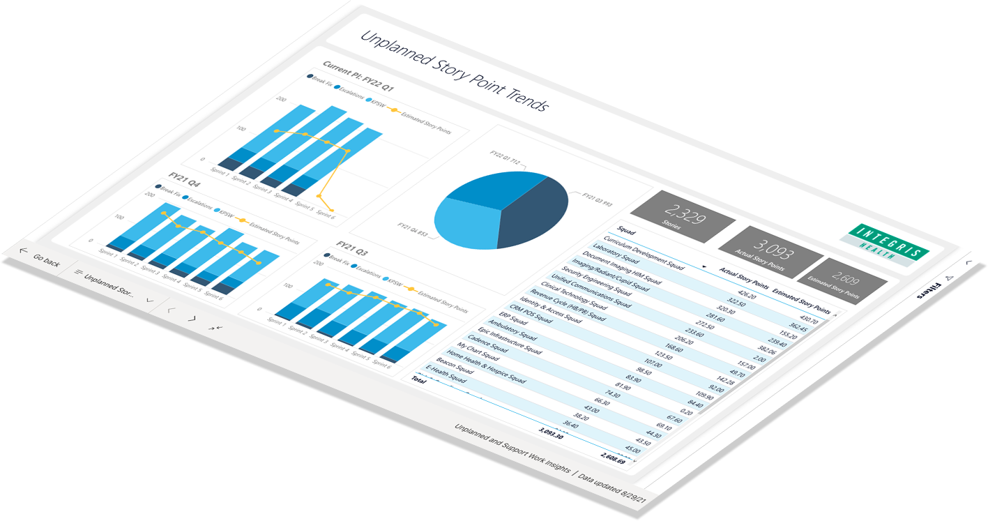
While developing our Power BI data visualization system, we discovered new opportunities for INTEGRIS to leverage data from their AGILE tools in ServiceNow. We built a series of dashboards that enabled the IT Department’s internal customers to request new products and track the progress of their development.

Let’s Connect