• Skip to primary navigation
  • Skip to main content
  • Skip to footer
  • Home
    What we do
    Who we are
    Our work
    Contact us
SolBurst

SolBurst

UX Strategy & Design

IT Portal on ServiceNow

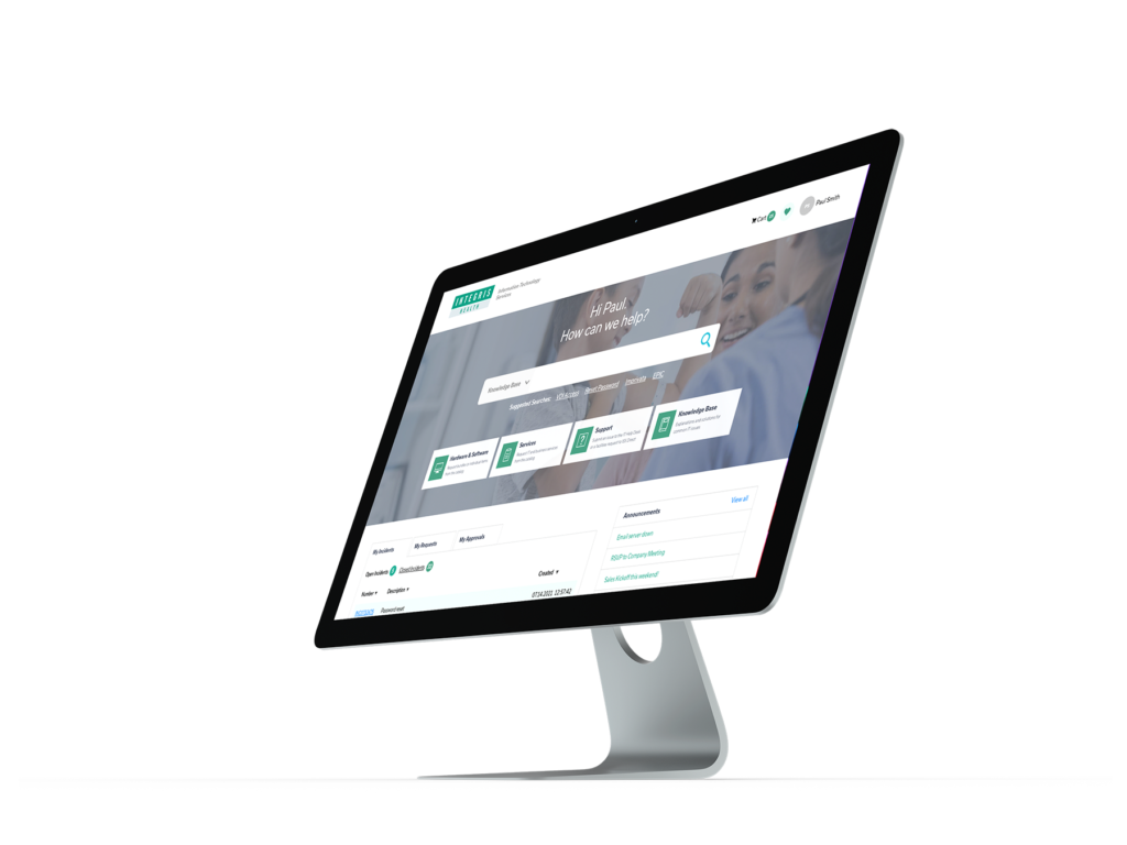
Here’s the story of how we revitalized an IT services portal used by thousands of healthcare system employees

Design Toolkit

Unfulfilled Promise

Like many organizations, Integris Health had a portal built on the ServiceNow platform that promised to make it easier and more convenient for employees to get IT products and services.

However, its implementation was not guided by any user research or UX design, and it failed to fully harness the platform’s powerful search and browse capabilities. Many employees simply gave up on finding the critical things they needed to do their jobs, and resorted to calling the IT Help Desk for everything. And when they did make a request on the portal, they didn’t know why their issue or request was taking longer than they expected because there was no feedback.

The Employee Experience

UX practitioners have always focused on optimizing digital experiences for external customers, for obvious commercial reasons, but the experiences of employees, or “internal customers,” have often been neglected. That’s changed. Now organizations realize that attracting and retaining talent is just as key to their bottom line, and that providing quality experiences for employees is essential.
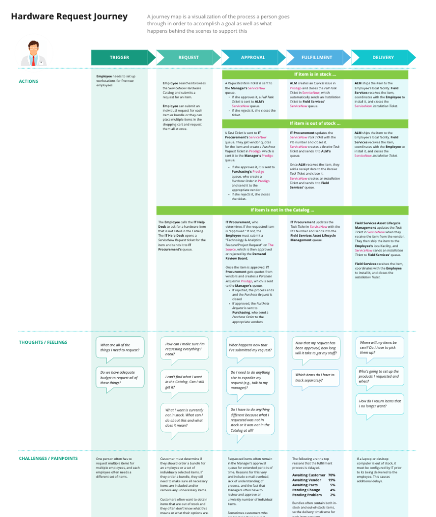
We mapped out a typical employee’s experience requesting hardware (e.g., a laptop) as well as their experience seeking support from the Help Desk.

Rebuilding from the Ground Up

In order to increase employees’ ability to find the right product or service for their immediate needs, we had to start with the portal’s underlying data structure. We were able to significantly improve the browse and search experiences by establishing a more organized and logical taxonomy.

Our focus was to remediate the core UX issues ⏤ product and services taxonomy, navigation design, product pages, and search ⏤ by revising not only the portal’s look and feel, but its organization and content

Keeping the Employee in the Loop

We redesigned the portal’s interface with an emphasis on giving the employee more control. And giving the IT organization more opportunities to communicate positively with employees. Drawing on what we learned about behind-the-scenes activities, we designed a portal home page that surfaces everything an employee would want to track.
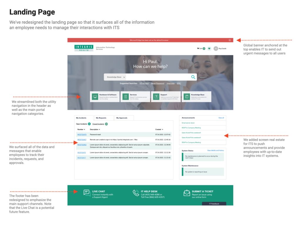
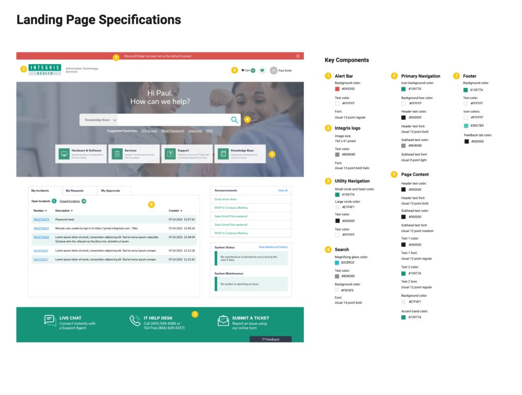
One thing we learned working on this project is that, if you are helping someone fix or get something, the worst thing you can do is avoid communicating with them when things are delayed. If the customer is not given any insight into what is going on, they will be much more likely get upset.

Interface Clarity Leads to Better Decisions

  • Depicts the portal’s new user interface, which includes navigation, search, catalog item “tiles,” catalog item detail pages, and form elements
  • Employs an updated catalog taxonomy and navigation design
  • Features new content such as item labels, descriptions, and photography
  • Demonstrates how search could be better deployed to find both knowledge base articles and catalog items

We have also analyzed the core “behind-the-scenes” workflows for product fulfillment and the provision of services in order to identify opportunities to improve the customer experience.
Category Page Specifications
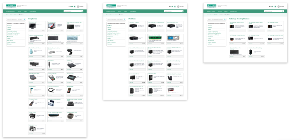
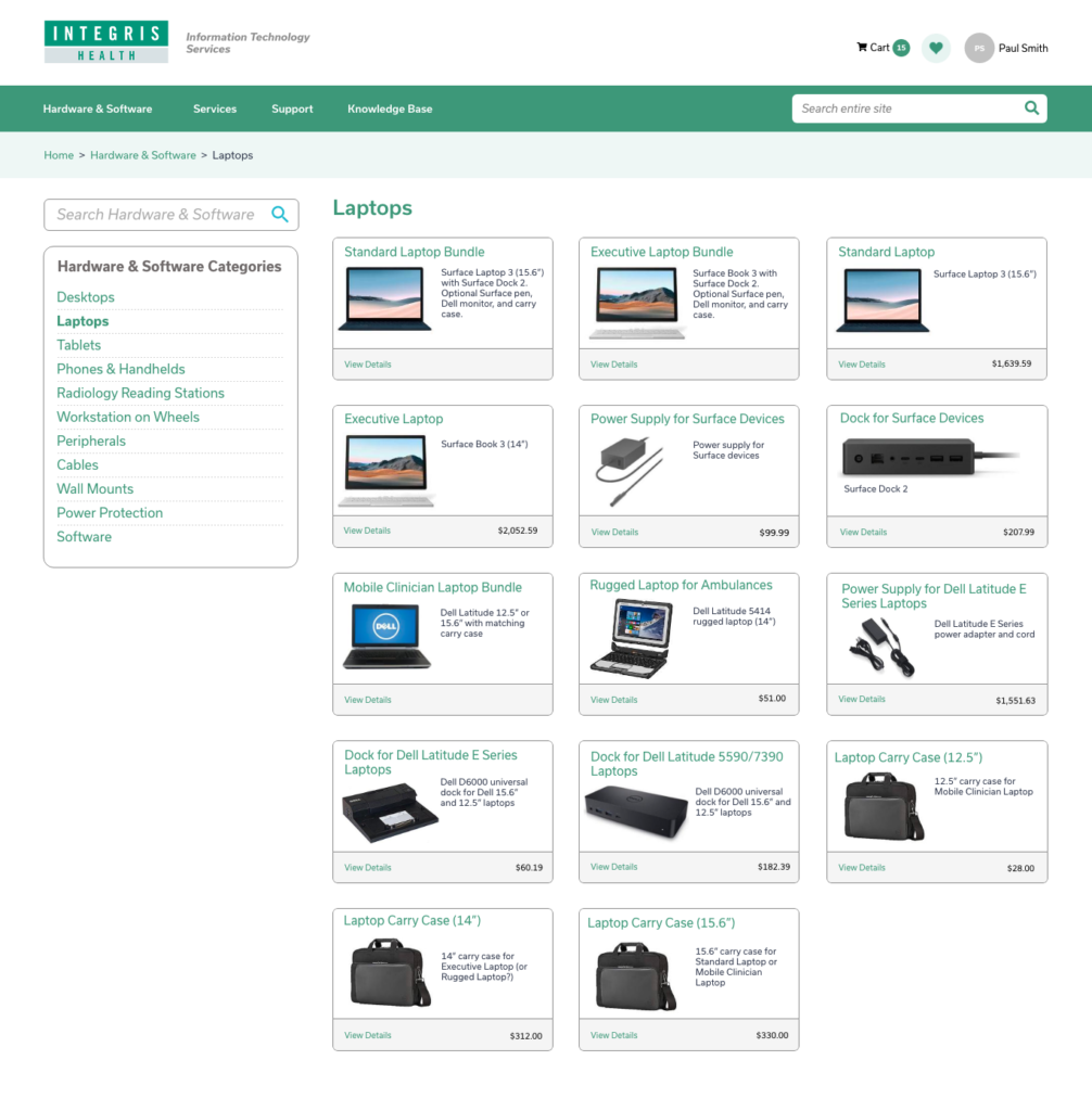
Hardware Category Pages
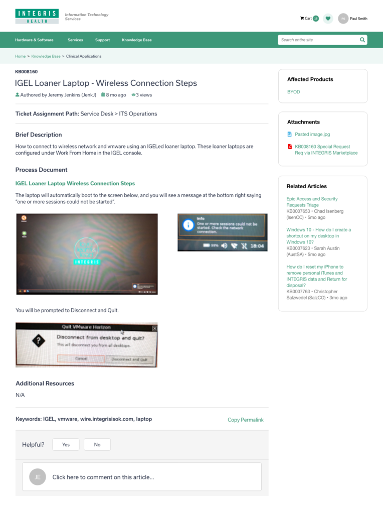
Knowledge Base Article Page

We created an entirely new layout for article pages. Note the removal of star ratings, which we believe had not proven to be reliable or useful as an article filtering mechanism.

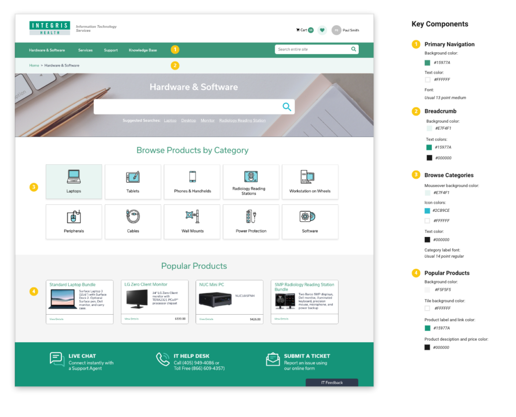
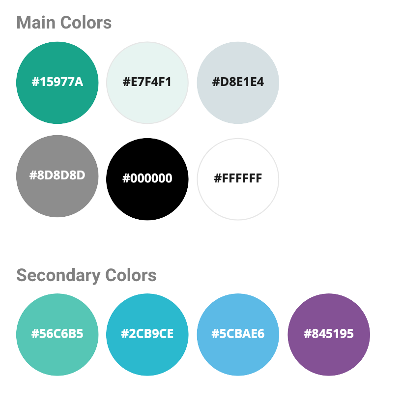
Portal Color Palette

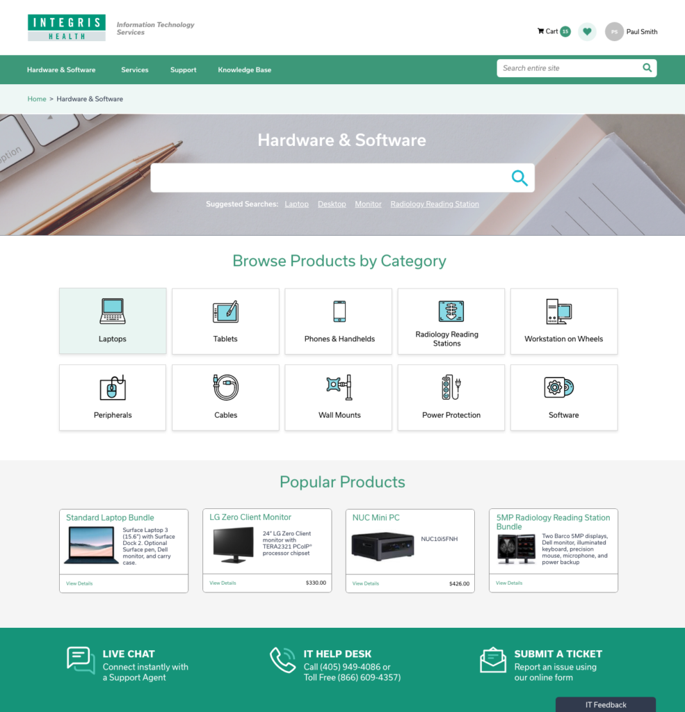
Browse Hardware & Software Catalog

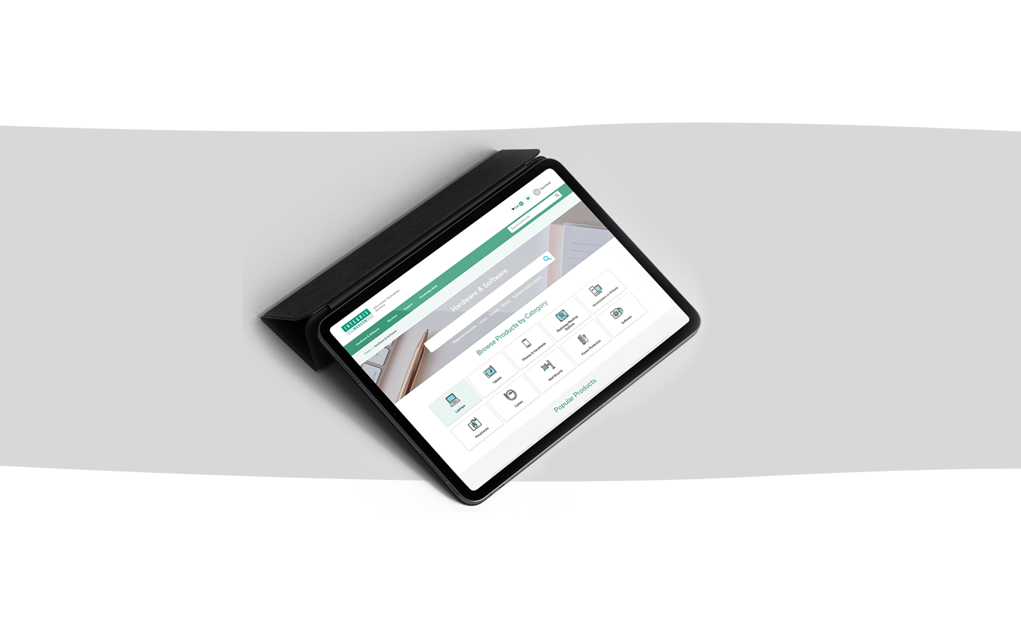
We designed a section landing page for use in all three of the site’s main sections. It supports both section-specific searching as well as browsing of each section’s hierarchical structure.

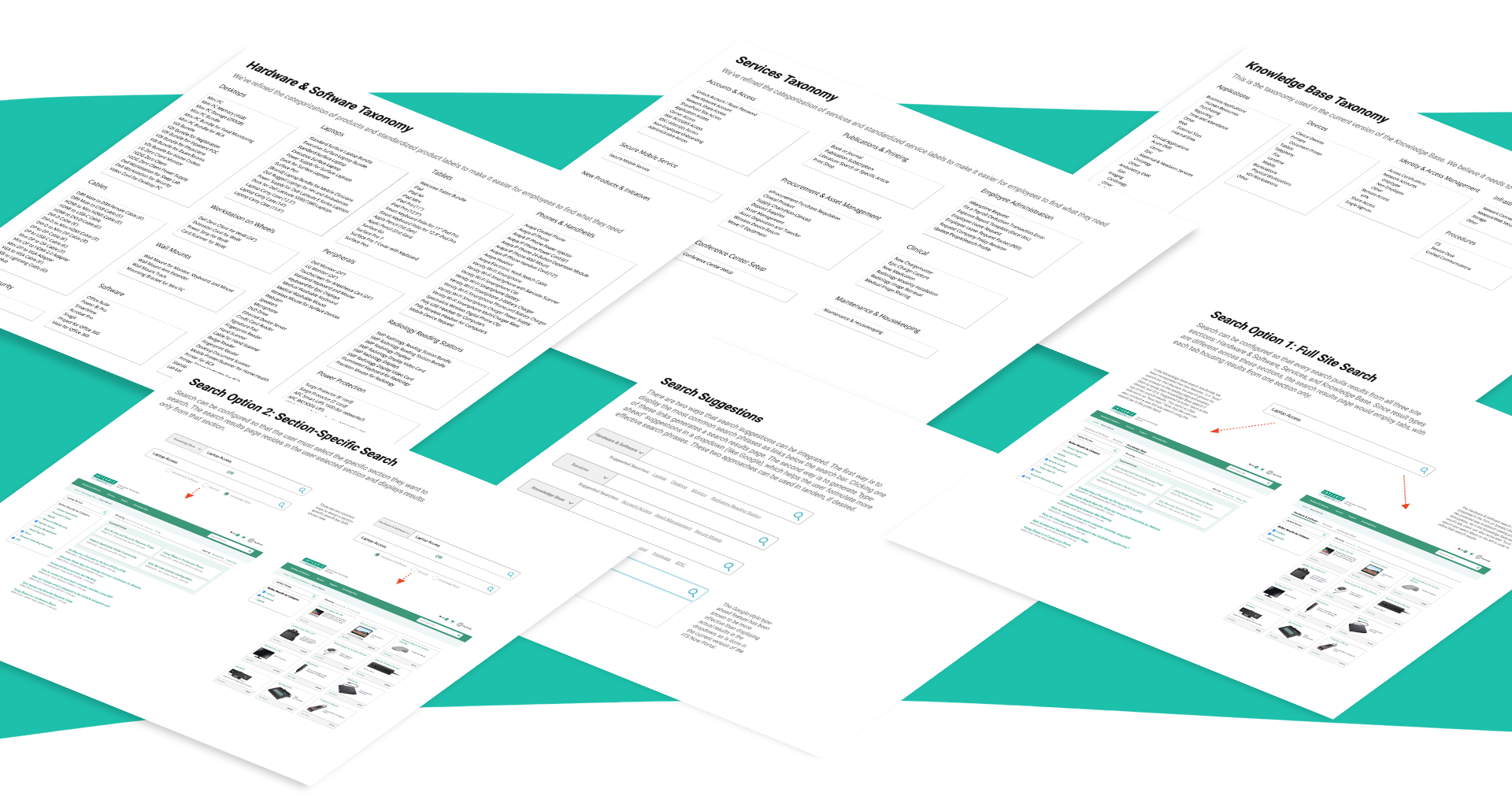
We’ve revised product categories and integrated both bundles and individual products into them. The full revised product taxonomy is in the Appendix of this document. We recommend that the “Popular Products” be curated manually to ensure that it features the products most often sought by employees.

Individual category pages display individual product “tiles” in an intentional order and arrangement aimed at maximizing employee’s ability to browse and compare products and product bundles.

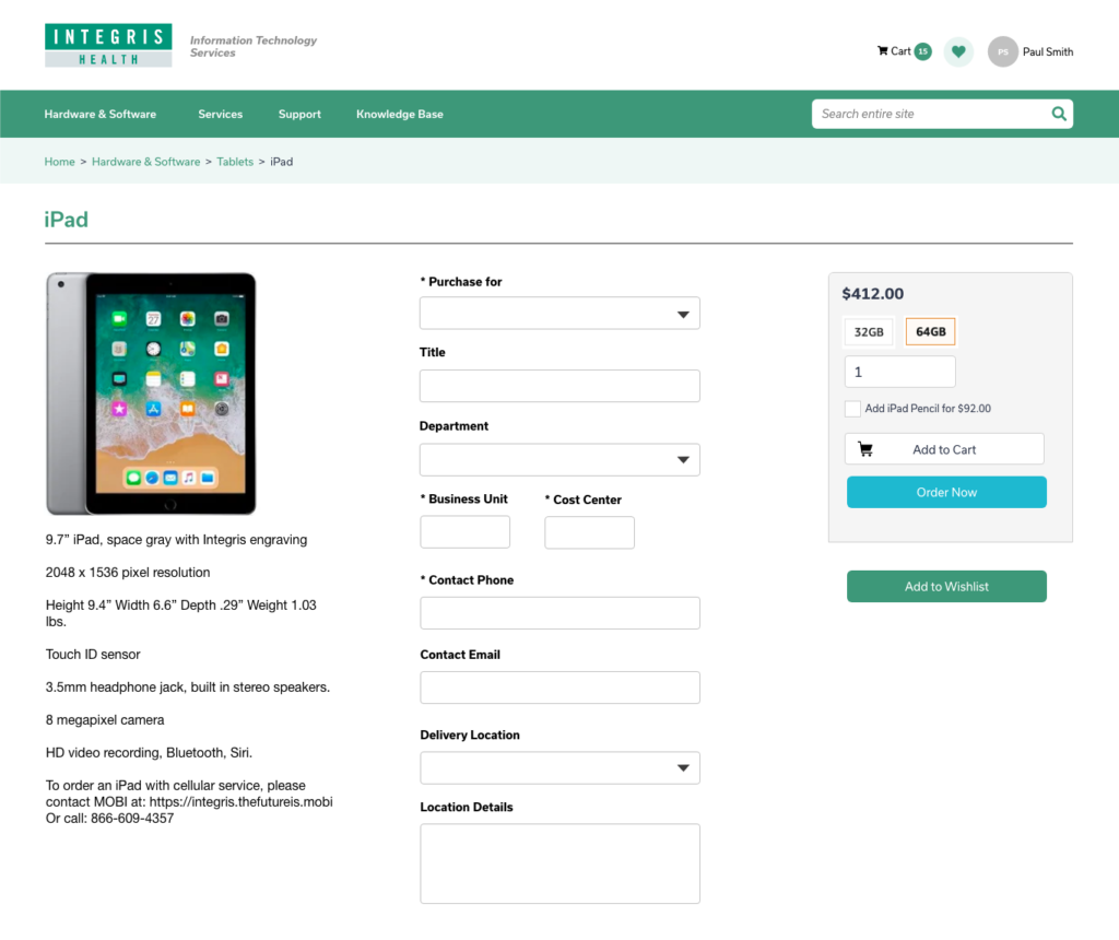
Product Detail Page

We employed a vertical design pattern for the product detail page and reorganized the sequence of form fields to make the overall process more intuitive. This format also provides more screen real estate for product images and descriptive text.

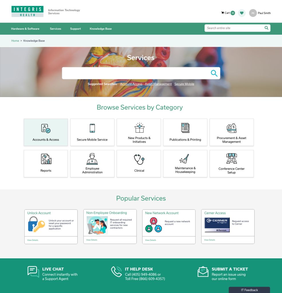
Browse Service Catalogs

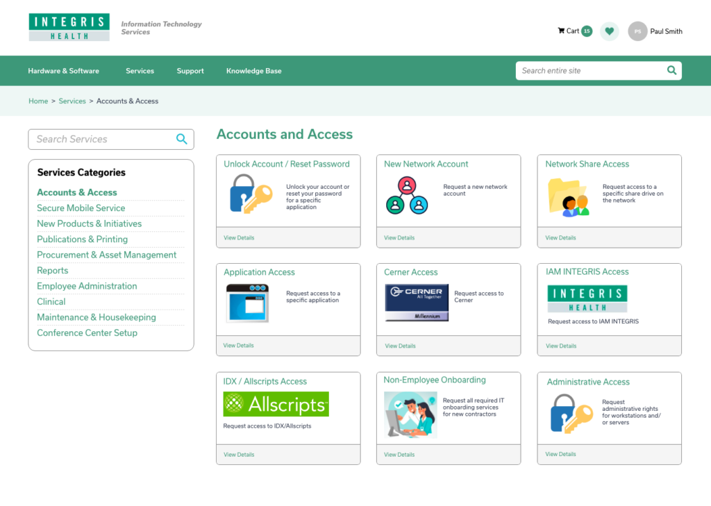
We designed a section landing page template to be used in all three of the site’s main sections. It supports both section-specific searching as well as browsing of each section’s hierarchical structure.

The full revised services taxonomy is in the Appendix of this document. We recommend that the “Popular Services” section below be curated manually to ensure that it features the services most often needed by employees.

Individual category pages display individual service “tiles” in an intentional order and arrangement aimed at maximizing employee’s ability to identify the service that is most appropriate to their immediate needs.

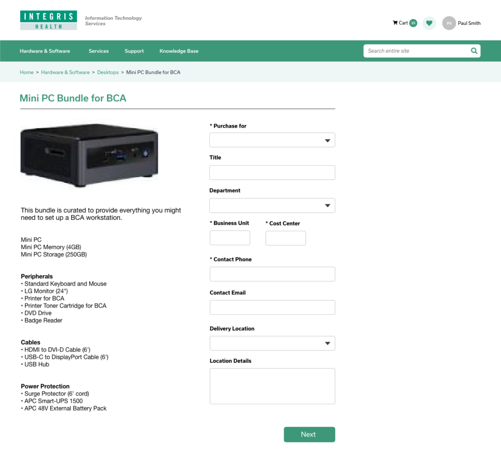
Product Bundle Detail Pages

We employed a vertical design pattern for the product bundle detail page and reorganized the sequence of form fields to make the overall process more intuitive. This format also provides more screen real estate for product images and a list of all of the items in the bundle.

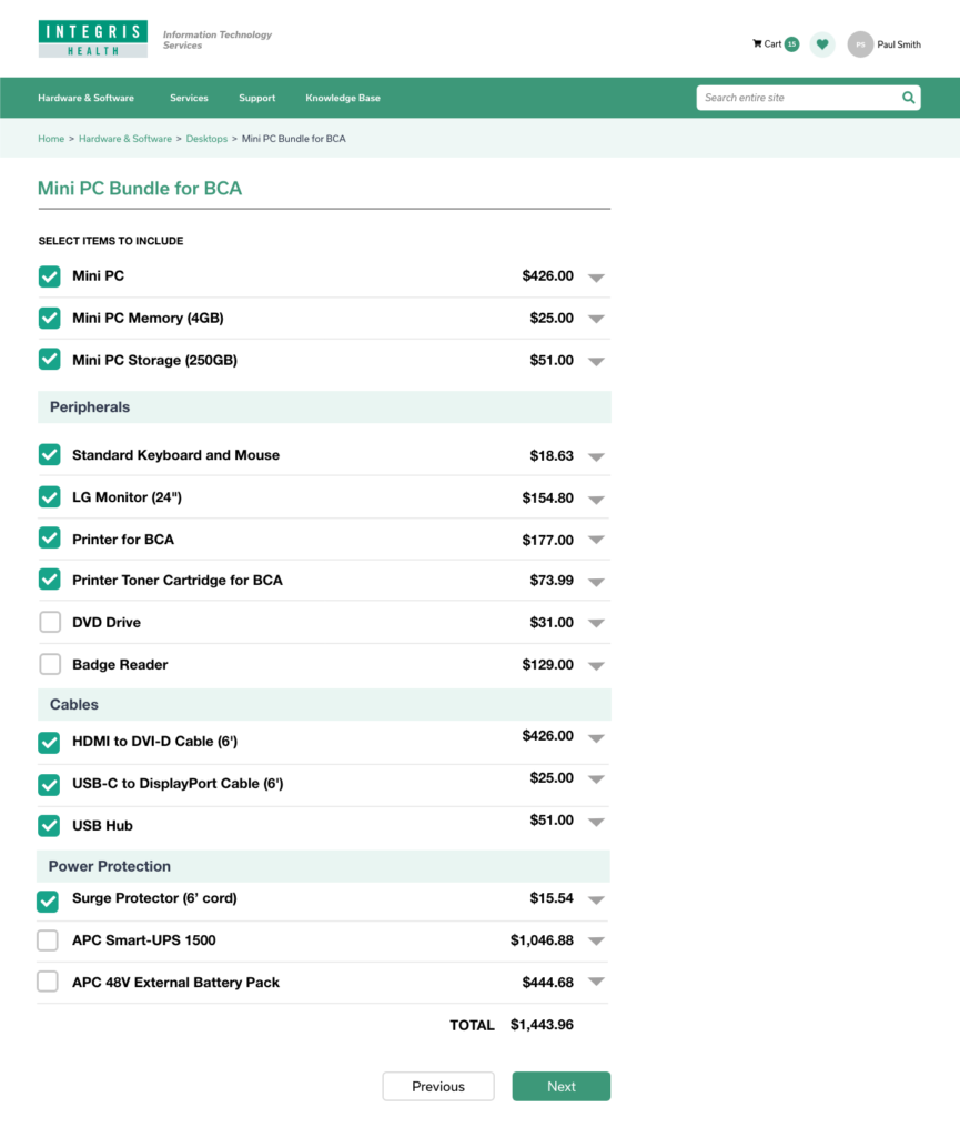
We’ve redesigned the Step 2 page to enable the user to more quickly review all of the bundle’s item and identify any that they want to remove.

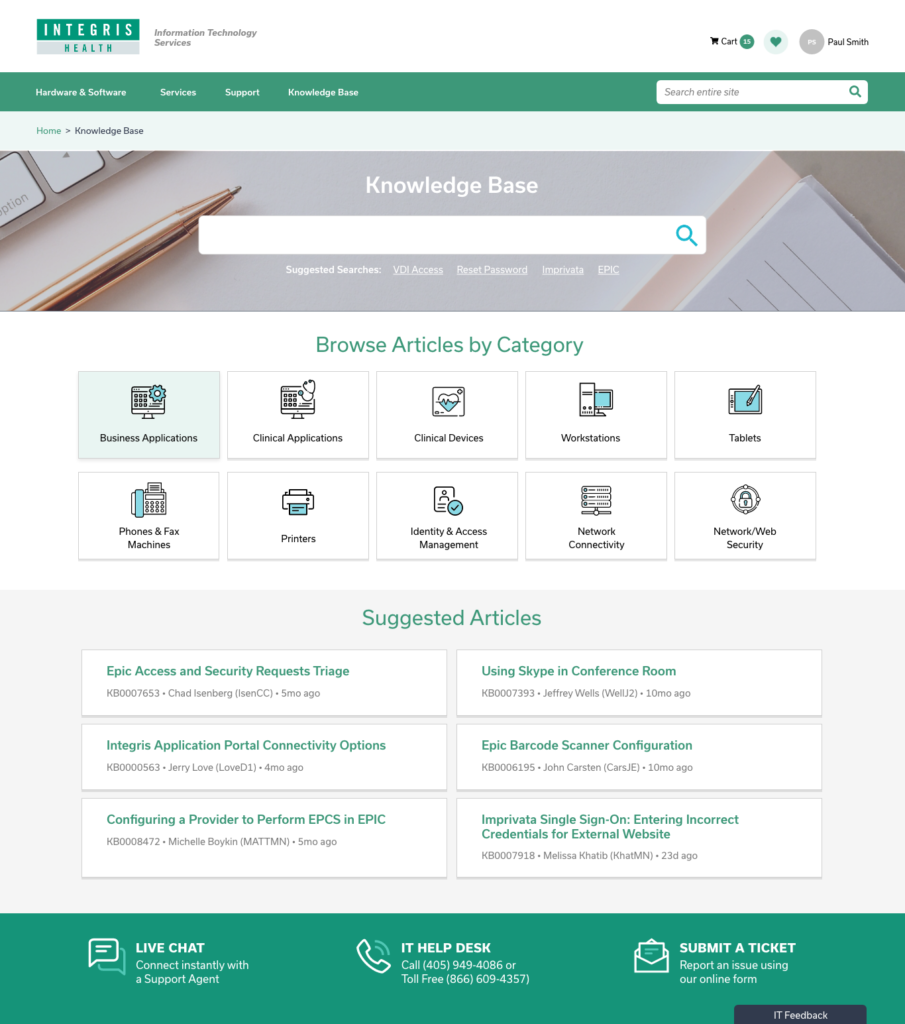
Browse Knowledge Base

We designed a section landing page template to be used for all three of the site’s main sections. It supports both section-specific searching as well as browsing of each section’s hierarchical structure.

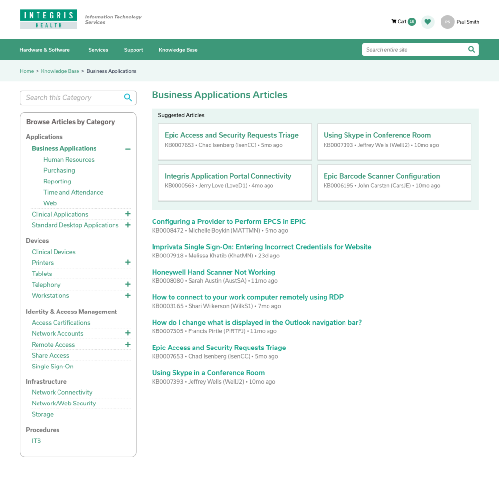
We redesigned the manner in which the topic categories are displayed to make it easier for employees to find the specific articles they need. We recommend that “Suggested Articles” be curated manually to ensure that only the most widely useful articles are displayed here.

We redesigned the manner in which the topic categories are displayed in the navigation to aid browsing. The current Knowledge Base taxonomy is included in the Appendix of this document.

Content is still king

Let’s Connect

Book a Call

Footer

  • Let’s start solbursting!

    St. Pete / Tampa FL | Washington DC

    Linkedin
    • Home
    • What we do
    • Who we are
    • Our work
    • Contact Us

Copyright © 2025